
GUIDE
Menu board design: 10 tips customers will notice
By Rune Breinholt Andersen · Updated October 24, 2026
A menu board has a few seconds to do its job. Customers read it from a distance, often while standing in a queue, and they need to find what they want and what it costs. These menu board design tips focus on what makes a board easy to read, so customers order faster and with more confidence.
1. Size text for the viewing distance
The most common mistake is text that looks fine on a laptop but is too small on the wall. A widely used rule of thumb is 1 inch (2.5 cm) of letter height for every 10 feet (3 meters) of viewing distance.
Want exact numbers for your screen? Use our free menu board font size calculator.
| Viewing distance | Minimum letter height |
|---|---|
| 1.5 m (5 ft), at the counter | about 1.3 cm (0.5 in) |
| 3 m (10 ft), in the queue | about 2.5 cm (1 in) |
| 4.5 m (15 ft) | about 3.8 cm (1.5 in) |
| 6 m (20 ft), at the entrance | about 5 cm (2 in) |
Make item names and prices the largest text on the board after category headings. Descriptions can be smaller, but should still be readable from the queue.
2. Do not put too many items on one screen
More items means smaller text. As a rough guide for a full-screen menu viewed from the queue:
| Screen size | Items per screen |
|---|---|
| 32 inch | 6–8 |
| 43 inch | 8–12 |
| 55 inch | 12–16 |
| 65 inch | 14–18 |
If your menu is longer, use more screens or split it into pages instead of shrinking the text.
3. Use strong contrast
Light text on a dark background, or dark text on a light one, is the easiest to read. Aim for high contrast on prices and item names. Avoid placing text directly on busy food photos. If you use a photo behind text, add a dark overlay or keep the text on a solid area.
4. Pick fonts made for reading
- Use one or two font families at most.
- Use bold or semibold for categories, item names and prices.
- Avoid thin and light font weights. They disappear on screens and from a distance.
- Avoid all-caps for long text. It is fine for short category headings.
5. Organize the menu into clear categories
Customers scan by category first. Group items into a few clear sections, such as burgers, sides and drinks, and leave extra space between categories. Use the same order on every screen and in your printed and online menus.
6. Align prices
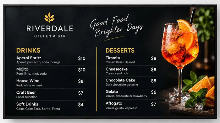
Put prices in a consistent position, usually right-aligned in one column. Customers compare options by scanning down the price column. Use the same price format everywhere, for example always two decimals or never decimals.
7. Highlight what you want to sell
People tend to look first at the top of a menu and at anything that stands out. Use that space for best sellers, meal deals and high-margin items. Highlight one or two things per screen. If everything is highlighted, nothing is.
8. Use photos with care
One large, high-quality food photo can sell a dish. Many small photos make a board feel busy and push the text smaller. Use photos for the items you most want to sell, and keep them sharp and well lit.
9. Leave breathing room
Keep margins around the edges of the screen, at least 5% of the screen width, and space between items and categories. White space makes a menu board look more premium and easier to read.
10. Test it from where customers stand
Before you call it done, stand where your customers queue and read the board. Can you read every item name and price without squinting? Check it at different times of day, because sunlight and glare change how readable a screen is.
Let the layout take care of itself
Following all of these rules by hand takes time, and every menu change can break the layout. MenuScreen applies them automatically. You add your menu, choose a template, and MenuScreen arranges categories, items and prices into a clear 16:9 layout. When the menu grows, it adds pages in the same design instead of shrinking the text.
Next step: read how to make a digital menu board.
FAQ
Menu board design questions
What font size should a menu board use?
A common rule is about 2.5 cm (1 inch) of letter height for every 3 meters (10 feet) of viewing distance. For customers reading from 3 meters away, item names and prices should be at least 2.5 cm tall.
How many items should be on a menu board?
On a 55-inch screen, around 12 to 16 items per screen stays readable from the queue. For longer menus, use more screens or pages.
Should a menu board have pictures?
Yes, but use them carefully. One or two strong food photos work better than many small ones, and text should never sit on a busy part of the image.
What is the best color scheme for a menu board?
High contrast works best, such as light text on a dark background. Use your brand colors for accents, categories and highlights.
Create a menu board customers can read
Try MenuScreen free for 14 days. No credit card required.